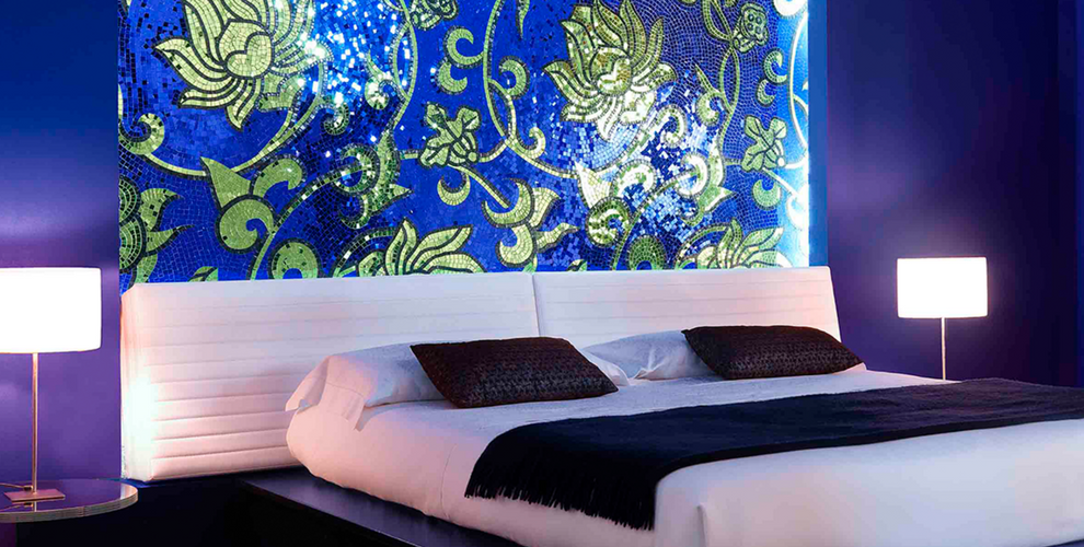
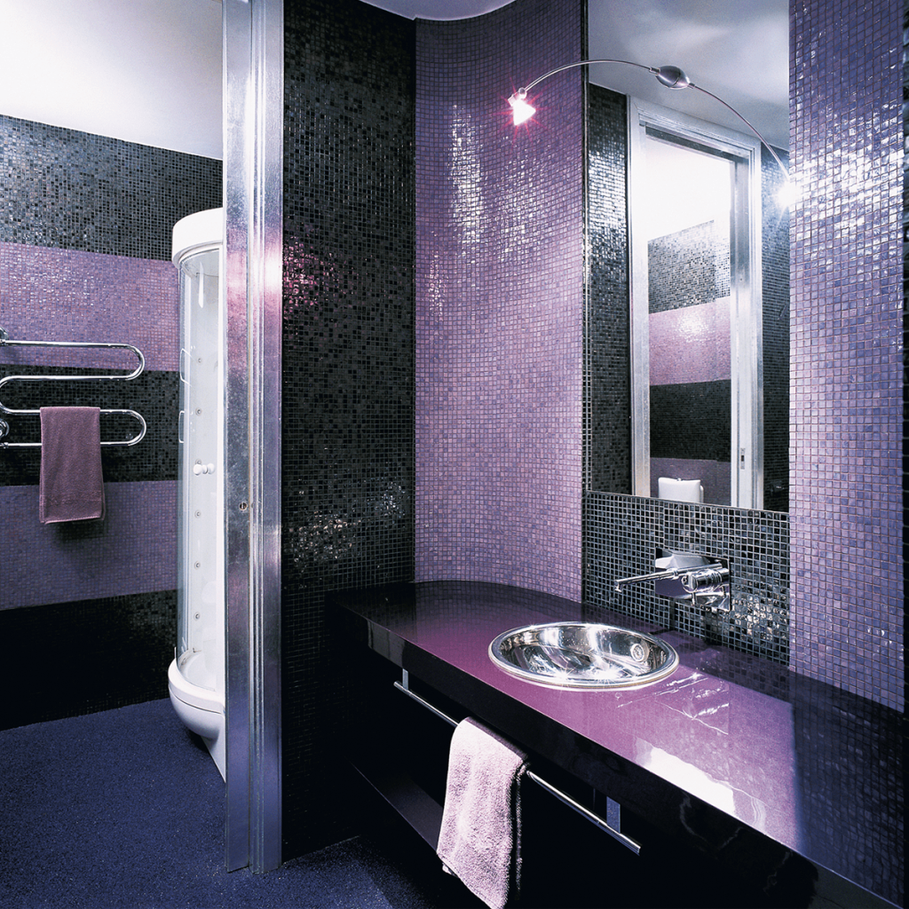
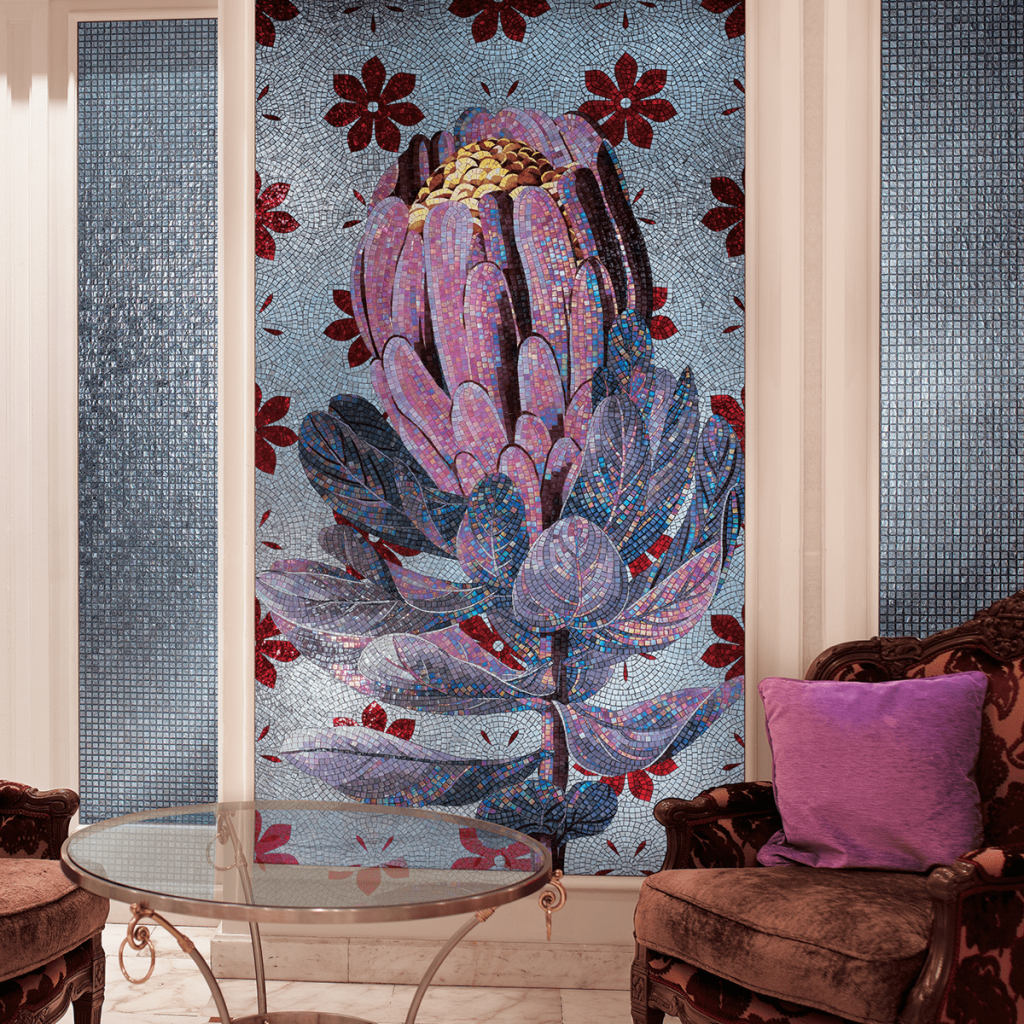
Pantone color of the year is ultra violet and we interpreted in our mosaics, from the extravagant Flower Power collection to the stylish Glass collection. From runaways to interior design solutions, Pantone ultra violet looks to be the trendiest of colors this year and we definitely couldn’t miss it.
Pantone ultra violet it is said to have a spiritual quality and therefore it is perfect for rooms that can be considered a refuge from today’s over-stimulated world. This shade of purple is a very provocative and thoughtful one and it points us toward the future.
Having a great inspiring power is no surprise that we chose Pantone ultra violet as the background color of our flower mosaic compositions we put in our living rooms.
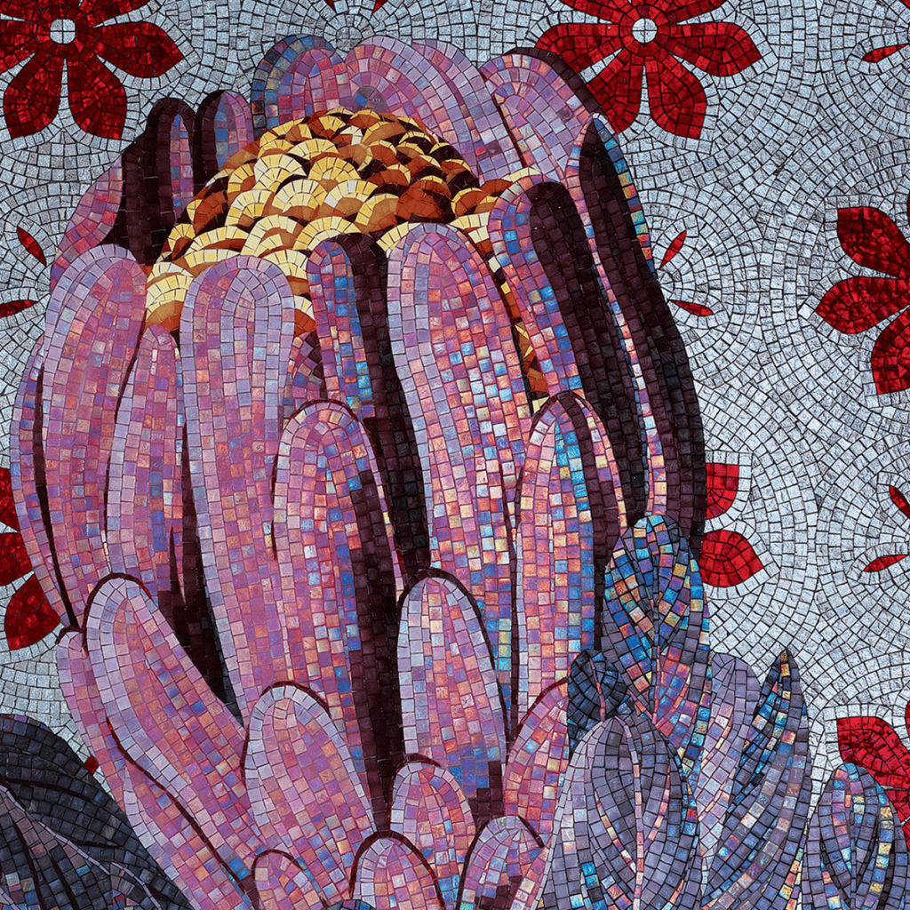
Each of the violet tiles we use expresses our inventiveness, imagination, and originality and it contributes to give a mosaic composition that intriguing feeling of what lies ahead.
When seeing Pantone ultra violet in our great artistic mosaic, you feel the instant desire to know a world beyond our own. The more you look at it, the more you see its power to break boundaries growing.
Violet represents experimentation, something you might want to embrace in your kitchen. We used violet tiles for less extravagant composition, but definitely stylish. You can see the cool Pantone color here as the dominant tone of this kitchen mosaic pattern.
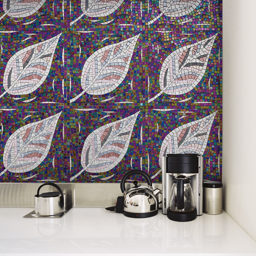
This is just a foretaste of our mosaic dedicated to the trendy Pantone 2018 color, but follow our Instagram and Facebook account to see all our interpretations of this amazing color.

